
When you have a small space in web application toolbar, you may want to use icon button for a search feature, when click, it expands and displays an input search bar and allows you to type any search string and collapse when toggle close button, I’m going to implement an expandable search bar web component with Angular material & Angular animation support.
Perquisitions
- You have angular application setup and running correctly
- Angular Material has been integrated properly
Add Angular animations dependency
ng add @angular/animationsImport BrowserAnimationsModule module if you don’t have it yet.
Compose animations
Add animations property to the web component.
  animations: [
    trigger('openClose', [
      state(
        'open',
        style({
          width: '200px',
          opacity: 1,
        })
      ),
      state(
        'closed',
        style({
          width: '0px',
          opacity: 0,
        })
      ),
      transition('open => closed', [animate('0.2s')]),
      transition('closed => open', [animate('0.2s')]),
    ]),
  ],
In this example, I have defined a trigger which tells angular when to trigger the animation on UI, then have 2 states available : open & closed, each state defines what style should be applied to the HTML element, lastly, there’re 2 transitions for this animation open => closed & closed => open, they define times that applied to each state change.
Next, I’m going to define a boolean variable (flag) to tell angular when to trigger which state
  hide: boolean = true;

  toggle() {
    this.hide = !this.hide;
  }
Above code segment defined a boolean variable and a toggle method, when hide value is true, I want the closed state to be presented, then use a button in HTML template to toggle the hide value in order to change state correspondingly.
Apply animations to HTML template
Now it’s time to draft HTML template and apply the animations
<div class="search-bar-container">
  <mat-form-field [@openClose]="hide ? 'closed' : 'open'">
    <mat-label>Search</mat-label>
    <input matInput placeholder="Search" value="" />
  </mat-form-field>
  <button class="spacer" mat-icon-button (click)="toggle()">
    @if (!hide) {
    <mat-icon>close</mat-icon>
    } @else {
    <mat-icon>search</mat-icon>
    }
  </button>
</div>
Above example defined an input search box and an Icon button.
To tell angular when to trigger the animation, I defined an input parameter for the mat-form-field -> [@openClose], when the hide variable is true, pass the open value to the input parameter, and closed when it’s false.
The Icon button below will trigger the toggle method, which updates hide value each time click on it. the icon will change based on the hide value.
Test it out
When click search icon button, below search input shows with a close icon button
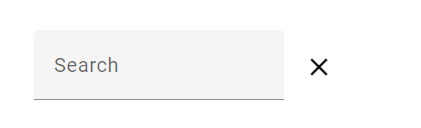
when close button is clicked, entire search input is hided and only shows a search icon button

Full source code available at: https://github.com/leveraon/learning-angular/tree/main/src/app/icon-search-bar